Jewelry Selection Enhancement

Expanding product selections for a fuller shopping experience

7 Months
UX & Graphic Design
Desktop, Mobile
Problem
On JCPenney.com’s fine jewelry pages, the existing data setup limited product selection by preventing the grouping of variations like metal type, stone, karat, and color on a single product page.
Opportunity
A competitor usability study showed that users preferred comparing ring variations on a single page, revealing an opportunity to improve usability by consolidating all jewelry options onto one product page.
Solution
Drawing from in-depth competitor analysis conducted by the research team and myself, my design lead and I teamed up to mock up three prototypes for an usability study.
Prototype 1:
- Stacked Selectors
- All-encompassing product title
- Price near Add to Cart
Prototype 2:
- Carousel Selectors
- Generic product title
- Price near product image
Prototype 3
- Carousel Selectors
- Dynamic product title
- Price near Add to Cart and on sticky bar
Based on the gathered data, we confidently moved forward with these recommendations:
Limiting product selectors to five per page to avoid scrolling between selectors and product images
Implementing the selectors as a carousel to minimize excessive vertical scrolling
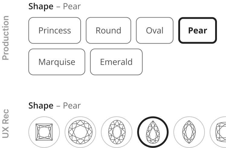
Using visual facets for stone shape and metal type to enhance scannability
Identifying key product selectors that need image updates to enhance visual guidance for users' purchase decisions
Here's a side-by-side of what's previously in production and the final designs:
Initial Assessment
MVP
Post MVP
Outcome
The jewelry page enhancement MVP went live in January 2025, right on schedule for Valentine’s Day. Just as planned! 🚀
The enhancement led to a significant sales boost, with plans to expand it to other jewelry categories as well as other departments.